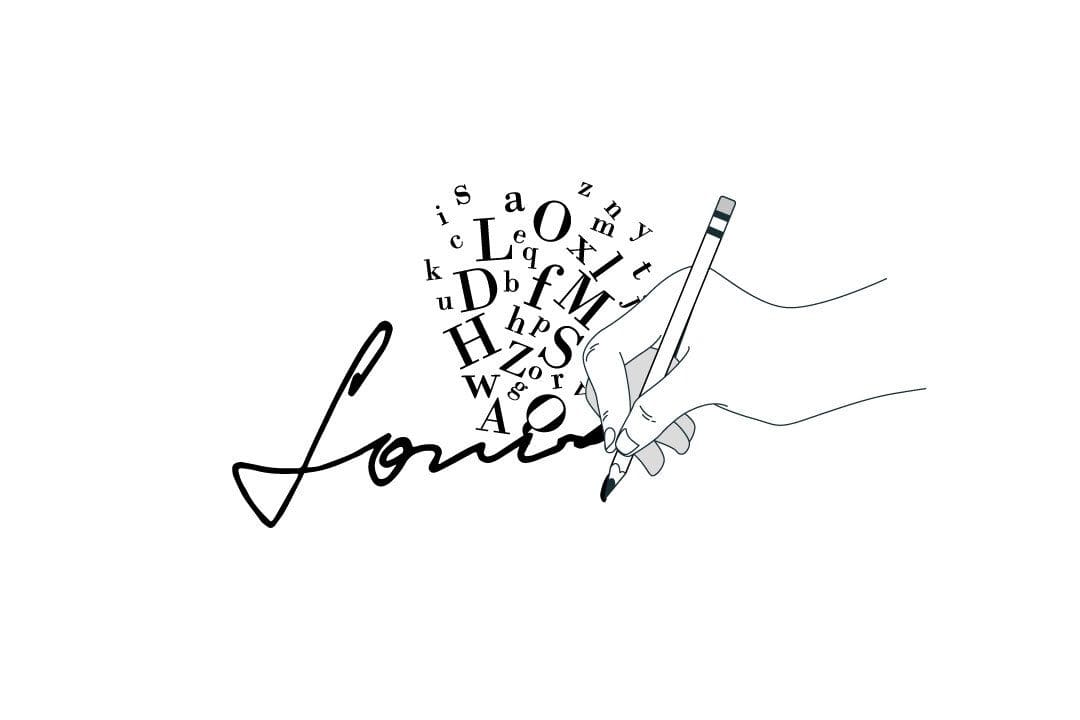
Fonts are an important part of any design. They can set the tone and create a specific mood or feeling. In addition, your chosen font can also be used to convey a certain message or idea.
Font pairings add a lot of character to your designs. By using different fonts together, you can create unique combinations that stand out from the crowd.
There are a variety of fonts available, and each has its own unique look and feel. When choosing fonts for your design, it’s important to consider the overall effect you want to achieve.
Always check the licence of the font to see if it’s available for free depending on its intended use – personal or commercial
Here’s our top 6 free font pairings for the season:
Gotham and Charlotte Southern
For a country meets city feel, this evokes images of cross country road trips with big city destinations. This is a good choice for a music single release or a travel contest announcement.
Bebas Nueu and Montserrat Alternates
Capture a modern spin on art nouveau styles of the 1920’s, great for easy to read labels. Check out more on the use of Retro inspiration for your designs here. Use this font pairing for an upscale evening event invitation.
Opens Sans and Yellowtail
This elicits a warm sunshine glow over wine on the dock. Whimsical and eye catching with bold hypertext and romantic cursive to soften the blow. A great choice for a book cover!
Cinzel and Raleway
Think classy cocktails on the roof of a ritzy hotel. This pairing screams casual decadence with its simplistic sharp lines and minimalistic curves. Perfect for a modern wedding or corporate event.
Playfair Display and Roboto
Play is in the name and this is perfect for fun text aimed at catching attention. This can appeal to of parents with kids, while still maintaining a clean aesthetic. Think home décor magazine or toy store signage.
Six Caps and Moonrising
The ultimate in cool. Here is a hip pairing of sharp peaks and bold elongated type that captures attention and does not let it go. Think that chique new nightclub catering bottle service to lush private booths.
When thinking of design and font pairings it’s important to keep shape, form, colour and balance in mind. Read up on The Basic Principles of Graphic Design for more guidance on how to make professional choices in your designs.
Not only are the basics important but when choosing font pairings you must also understand where these will be placed and what intention they serve. Font choice is more than just typeface! If you’re designing a wedding invitation you wouldn’t use the same pairings as a basketball team website.
Everything must come together to form a cohesive image and present the idea across all platforms.
Experiment with different fonts and see what works best for your project. With a little creativity, you can create beautiful and unique designs using fonts. Happy designing!
To keep receiving helpful tips for your designs, writing, and marketing subscribe to our newsletter!


