Graphic design is one of the most important aspects of establishing a business’ brand or online presence through various methods, including advertising and marketing campaigns. Used to create a visual representation of a brand, product, or idea, graphic design helps to influence how consumers perceive your business and its products and services. There are a few basic principles of graphic design that all designers should understand in order to create effective visuals. In this blog post, we’ll discuss some of these principles and explain how to use them to improve your advertising efforts.
Graphic design is an essential element in all forms of media. It has the power to grab attention, communicate ideas, and affect the overall look and feel of a message. Design is the process of using visual elements to communicate a message, it is all around us and we often don’t even realize it. Designers use color, form, line, shape, size, space, texture, balance, contrast, emphasis, movement, proportion, and rhythm to complete their designs.
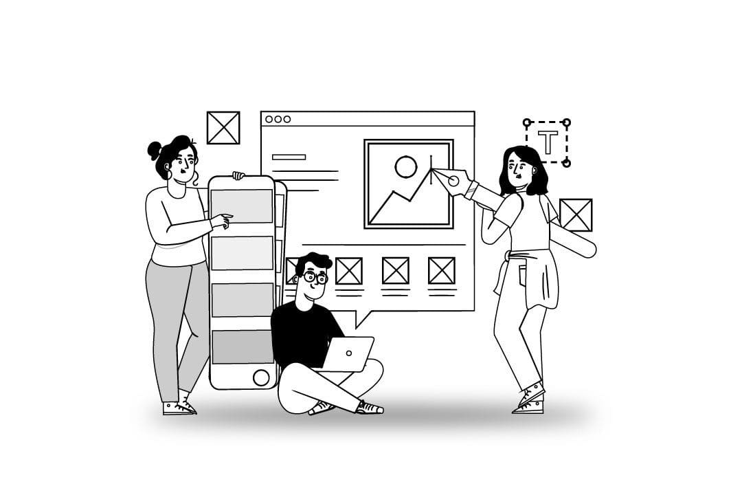
These are some basic principles of graphic design that every designer should know.
Color
Color is the property of light that enables us to distinguish blue, red, yellow, etc. It is one of the most important aspects of graphic design. Color can create moods, set a tone, and draw attention to certain elements. There are three properties of color that are important to consider: hue, saturation, and value. Hue is the name of a color. For example, red is a hue. Saturation is the color’s purity. Bright hues are highly saturated. As hues become darker, they lose their saturation and appear gray (or desaturated). Value is the color’s degree of lightness or darkness – with pure color having full value; shades with no color appearing black; and tints with no color appearing white.
Form
Form refers to the physical properties of a graphic element, such as its shape, size, and color. Different components of form include: light (shadows), color (tone and value), and space (negative and positive). These form tools create an overall effect through the use of balance, proportion, and emphasis. To form an overall balance in design there are three different types of form balance: symmetrical form (symmetrical), asymmetrical form (asymmetrical), and radial/angular form (radial). Symmetric designs balance properly when all elements within the composition mirror on each side of a vertical or horizontal axis. Asymmetrical form compositions balance better when weighting elements with off-center placement. Radial form compositions evenly space elements around a central point.
Line
Line refers to the visual path that a graphic element takes. A line is a mark that consists of two points. In graphic design, lines join objects together or to separate them from the background. Typography often uses lines for this purpose. Line is an important element of graphic design, and create a variety of different effects.
By understanding line and its properties, you can create more effective and visually appealing designs. Lines can join objects together, create movement and tension, and direct the viewer’s eye around the page. Lines can also combine with other graphic elements to create more complex designs. In fact, many of the basic principles of graphic design rely on the use of line. By understanding line and its effects, you can create more visually interesting and effective designs. Some of the most common line types include:
– straight line
– curved line
– line that bends and then continues
– that ends in a sharp point
– meets another line at a right angle (a diagonal line)
– dips before it continues on its way
Shape
Shape is determined by the layout of form and line. An important concept in graphic design, it is typically combined with other graphic concepts, like space and form, in order to create more interesting designs. Shapes can be defined as two-dimensional objects that have length and width, like squares, circles, and triangles. In graphic design, shape often creates order and hierarchy on a page by grouping related items together. For example, you might use a circle to contain all of the text on a flyer, or use squares to create a grid-like layout. Graphic shape holds importance as a concept because it can draw attention to specific content or guide the reader’s eyes around the page.
Size
Size is often used to create hierarchy and importance. Larger text or objects can draw attention to specific elements on a page, while using smaller text and objects for less important information. Size can also be used to create contrast between different elements in a design. For example, large text against a small background will create a strong contrast between size, while the same size text against a large background will create little to no contrast.
Designers can also use size to establish relationships between different elements on a page. If you have multiple objects sized similarly, they will appear to be related or grouped together. Conversely, if you size one object much larger than the rest, it will appear to be the subject of the other elements. Size is typically measured in points or pixels, though size can also be measured using millimetres (mm) and centimetres (cm). The size you choose for each element should depend on your medium and design goals.
Space
The space in graphic design is not literal space. It’s the space between elements on a page, which makes up for white space. Designers utilize space to separate elements, helping them stand out from one another and establishing an order of importance.
Here are the laws of space in graphic design:
The law of proximity states that elements close to one another are perceived as being related.
Similarity requires elements that look similar are perceived as being related.
Contrast requires elements that are different in color, size, or shape are perceived as being related.
Closure states that our minds are drawn to completing shapes, even if they’re not complete.
Continuation states that our eyes follow a line or shape until it’s interrupted.
Space is an important element in graphic design, as it can create hierarchy and emphasis, as well as to organize information. By understanding the basic principles of space, you can create designs that are both visually appealing and easy to understand.
Texture
Texture is the feel or appearance of a surface, used in graphic design to add interest and realism. This simulates with various techniques, including shading, line work, and textures brushes. It can also be created by using different materials such as cloth, paper, metal, and wood. When used effectively, texture can add depth and realism to a design. It can also convey a message or mood. For example, rough textures can create a feeling of chaos or disorder, while smooth textures can convey a sense of calmness or order. Texture is an important tool for graphic designers and should be used sparingly to avoid overwhelming the design. When used correctly, texture can make or break a design.
Balance
Balance is an important principle in graphic design, used to create a sense of equilibrium (stability and order) in a composition.
Symmetrical balance – when the elements on either side of the central axis evenly match (a mirror image of each other). This creates a sense of equilibrium and can be pleasing to the eye.
Asymmetrical balance – when the elements on either side of the central axis unevenly match. Asymmetry is more natural looking. Create asymmetry by arranging graphic elements in a way that creates an imbalance. The eye does not see the design as being unbalanced, but rather sees it as an intentional dynamic composition.
Control the viewer’s eye and create a sense of stability with balance or create tension and interest in a composition. When used correctly, balance can help to create a visually appealing and effective design.
Contrast
Contrast is the use of opposite elements to create visual interest. For example, light color against dark color or black text on white color. There are two types of contrast: color and value. Color contrast occurs by combining opposite colours – such as blue and orange. Value contrasts occur when elements with varying degrees of the same color values (light, medium, and dark) come together within a design.
Contrast is one of the most important principles in graphic design. Use contrast to create visual interest and to make elements on a page stand out. Contrast can be created with different colours, sizes, shapes, and textures. For example, if you want to highlight a headline on a website, you might use a large, bold font against a contrasting background color. Creating a sense of order on a page is another use of contrast. For example, you might use a grid layout with evenly spaced columns and rows to create a sense of harmony.
Emphasis
Emphasis is the focal point of a design. There are two types of emphasis: visual and textual. Color, size, and line create visual emphasis when pointing to a specific element within a design. Achieve textual emphasis by placing text in color or italics; setting it apart from the rest of the copy; and increasing its size.
Movement
Movement refers to the way that graphic elements flow within a composition. Achieve this by using curved lines instead of straight lines or by varying the size and shape of elements. Movement gives a design energy and vitality. There are many different types of movement in design. Simulated movement means items which seem to move or wave. Other movement occurs because the viewer scrolls through a website and elements flow from one side to the other. Movement can also simply refer to color movement, even if nothing appears to be actually moving across the page but the colours are shifting.
One of the most important aspects of movement in graphic design is using movement effectively without distracting from the main message or elements of the design. Too much movement can be overwhelming and confusing for the viewer. It is important to use movement in a way that supports the overall design, rather than detracting from it.
Proportion
Proportion is the relationship between different elements in a design. It’s the way one element plays off of another, their degree of contrast or similarity, determined by the size of one element in comparison to another. Proportion is an important element in graphic design because it can create a sense of harmonious balance or tension, proportionate scale, and unity or diversity. It draws attention to certain elements or to lead the viewer’s eye through the composition. Proportion can be described by numerical measurements (height to width ratios) but can also be observed when looking at shapes, lines, textures, colours, etc., in relation to each other. When used correctly, proportion can give your design a more professional and polished look.
Also important to note, proportion holds different associations in different cultures (i.e., the Western world thinks of proportion as “natural” or realistic, but in contrast proportion in Asian art creates “unrealistic” compositions.)
Rhythm
Rhythm is the pattern of movement in a design. It creates visual interest and movement in a design. Rhythm can be created through the use of lines, shapes, colours, and fonts and by using repeating elements, such as shapes or colours. It can also be achieved by varying the size, color, and shape of elements. When used effectively, rhythm gives a design a sense of continuity and predictability.
When using rhythm in your graphic design, remember to keep it consistent. If you are using a variety of line weights, for example, make sure all the lines in your design have the same weight. If you are using different colours, make sure they are all in the same color family. And if you are using different fonts, make sure they are all from the same typeface.
Conclusion
Graphic design is an essential element in all forms of media. It has the power to grab attention, communicate ideas, and affect the overall look and feel of a message. Designers use color, form, line, shape, size, space-everything mentioned above-to complete their designs.
If you’re looking for a way to make your business stand out, we invite you to subscribe and discover how access to unlimited graphic design can enhance your brand. This includes unlimited logo creation; custom branding elements like social media headers or presentations; infographics; mockups (like flyers); website graphics…you name it! Start today – Unlimited Graphic Design.