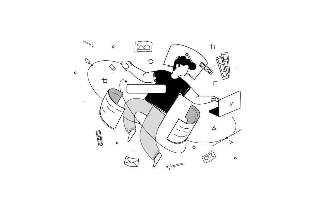
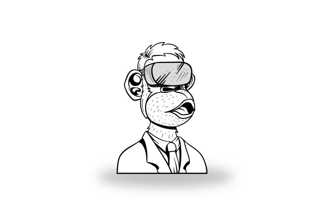
Minimalist graphic design is a style or design method that features simple shapes, clean lines, and aesthetic open spaces. It often has a high practical value while still being visually pleasing. Minimalist designs are used to make objects appear more simple, clean, and to call attention to the design itself, be it a digital design, painting, or an art installation. Minimalist design tends to be minimalistic because of its shapes, lines, colours, and not necessarily just the lack of details. The minimalist style is a popular choice among web designers, and social media marketers. It is easier to view this type of design on smaller screens without losing any of its intended impact.
This type of design should not be used if you’re trying to convey emotions or narrative. Although a minimalist graphic design is effective in repelling clutter, this also means it lacks details, which can make it difficult to convey large amounts of information.
The minimalist style of design pays particular attention to colours, typography, and the number of elements in the design.
Here are 5 tips that can help your minimalist graphic designs achieve great aesthetic success:
Tip #1: Be Selective with Typefaces
Perhaps the most important thing in minimalist design is to make sure all typography looks good. To achieve a minimalist design style you must choose fonts sparingly, and your text should look clear and legible. Typefaces generally come in two varieties: serif or sans-serif.
Serifs are the little decorative “feet” that extend from the ends of strokes in a letterform. Serif fonts are often used in print design and headline text. Sans-serif fonts are often used for body copy as they are generally considered easier to read. The main purpose of font choice is legibility; some may choose to use a handwritten script font to make text stand out, but this is not how you achieve minimalist design. Sans-serifs fonts lack these feet, and their design is more streamlined and minimalist.
Tip #2: Choose Your Colours Wisely
The minimalist style often means minimal color usage as well, but how you use color is very important to achieving the best minimalist design. One good thing about minimalist graphic designs is that it forces you to carefully select a few colours that will stand out. It is important to keep your palettes simple. You may not need more than two colours to achieve a minimalist graphic design, it is best to choose one color as your background and another as your accent color. The rest of the colours in the design should be either neutral or muted shades of these two colours for a complete minimalist feel.
Tip #3: Be Generous with Your Use of White Space
Keep in mind how to apply the effective use of white space when beginning any type of design. It is one of the most important elements in minimalist design, and design in general. White space can help determine your color palette while also giving text more room to breathe.
Avoid center balancing everything, especially in a minimalist design, as it can create a busy look. Instead, try to use the white space around your text creatively, for a better aesthetic effect.
Tip #4: Keep it Simple
Be careful about how many effects you choose for your design and be very selective about what images, text, and other elements you include in a minimalist designs. Don’t clutter up your design with elements that are not integral to the feel and look you are trying to achieve for your minimalist design style. Just narrow down your options and keep it simple.
Tip #5: Keep It Balanced
Make sure everything in your design is balanced. One way to do this is to divide an area of your design into thirds or halves vertically and horizontally. You can also use diagonal lines to balance design elements. For example, don’t place one design element on one side of your image with five on the other side. A neat technique to check and see if everything in your design harmonizes, is to visualize a grid over your design. Do the minimalist design elements line up with this grid? If not, go back into your design and adjust as necessary until everything lines up visually.
Click the links to learn more about Graphic Design Basics or book a demo with the the team at Brynga so they can show you how to build your brand using these core strategies.


